It was a good opportunity to mess around with Twitter's API, mess around with python (including pickling and caching), and mess around with R, which I've never touched before. I made minor changes to the code so I could include user names and poked at the other properties on the Twitter user object.
Despite it being all spelled out for me, there were some tricky bits. pip-ing the right Twitter api instance. I had to use twitter-python, not just twitter, so there was some installing and uninstalling to get it right. I could have used the OAuth/REST interfaces, but I wanted to mimic the article. In the Python, trying to add the username was a little tricky for me mapping what he dumped to the cache (dd) back against the file. The cache made it tricky because I had to remember to go kill it if I made model changes. R...I thought I had it all wrong because I couldn't see the ggplot graph AT ALL at first. But it was a sample size issue. I was using small accounts, not million-user accounts, so the alpha wasn't layering up enough to show any depth of color. A few minor changes to shape, alpha, size, and fill and it was easily visible, although it's less useful for real bot analysis. R was fun to play with, but does most of the heavy lifting with the tidyverse module. It was more about knowing the general syntax of the chart than doing any coding.
plt1 <- dd="" font="" ggplot="">
geom_point(aes(x = order, y = created_at),
color = "blue", fill="green", shape=21, alpha = 1, size = 2) +
xlab(sprintf("@%s's followers", username)) +
ylab("Join date") +
scale_y_datetime(date_breaks = "1 year", date_labels = "%Y")
To top it off, I think I maxed out my api rate limit, although I haven't checked. I hope I wasn't blacklisted. The number of calls is minimal, so if you're doing even as few as 1000 users, it can get maxed out quickly.
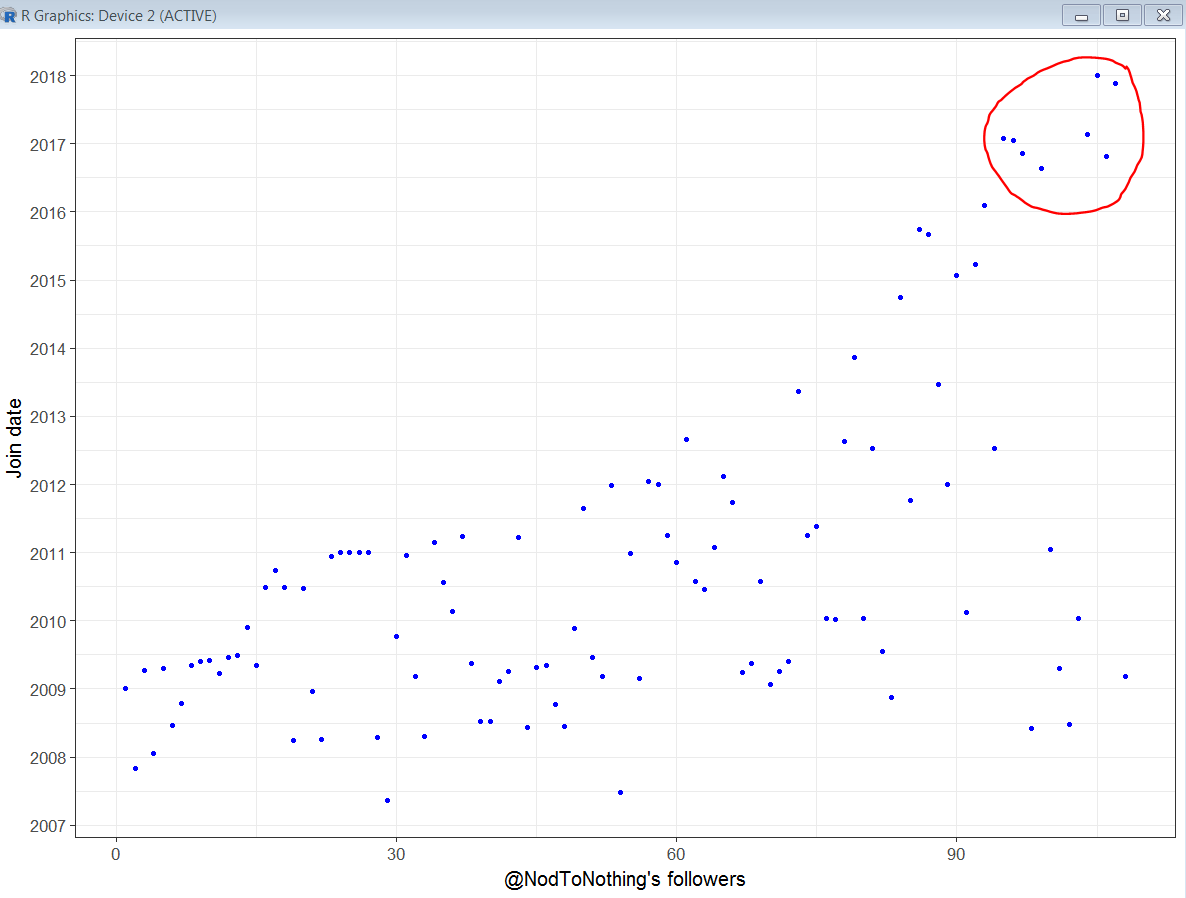
But, it worked for a while. Here's Klund with a pretty typical chart. A stable line since he started with a variety of users under the line and a little bit of clumping likely related to popular tweets.

And me. One of the devs I work with told me it looks like a dinosaur. The clumping in the circle, though minimal, is interesting because they're new people all at once. In my case, it's not bots, but some gaming and horror movie related companies that like some of my tweets.
No comments:
Post a Comment